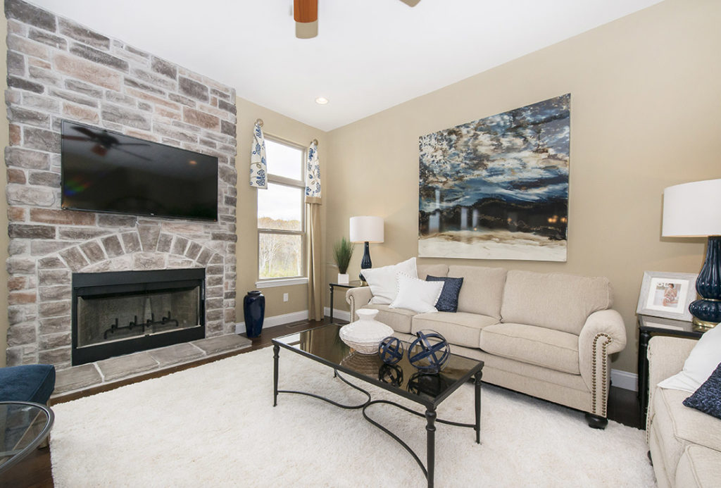
Autumn is one of the most inspirational times of the year. The crisp air and pumpkin spice scents fill the season with a sense of nostalgia unique to fall. It’s no surprise that we want to bring autumn and all it holds into our homes. The warm hues of the season can really bring out the most from your home when well-implemented. Here is our guide on ways you can integrate a fall color palette into your home.
Autumn has a full range of colors and tones to provide you with a plethora of color combinations, offering plenty of options to pick from that suit your needs and home best. Between warm, cool, vibrant, and muted tones, you can choose a range of colors that go together well. If you’re feeling stuck, take a step outside and get a photo of the trees for inspiration! In this post, we’ll be using an example palette with red (F03D1D), orange (A84300), brown (433129), yellow (DDBA34), purple (341C6D), and green (4D6207). This mix of standard fall colors and the transitional green will give your home balance. After selecting your own colors, you can move onto incorporating them into your home, room by room.

A place to relax and unwind, the bedroom is a perfect place to use these calming colors. Start off by using a soothing color on the walls, like our green or purple. This will ground the room with a color that’s easy on the eyes. Use the remaining colors on your sheets, pillows, dressers, and other furniture. A brown nightstand, red sheets, and purple curtains can bring the room together. Find an eye-catching rug in one of the colors to give the room another relaxing focal point. Curtains or blinds are a great area to use any darker colors to help filter light coming in from windows. Yellow can be brought in using your lighting; give your rooms a pleasant glow by swapping standard bulbs with natural light bulbs.
How you fashion your kitchen using these colors will depend on the mood you’re trying to create. Look to kitchen appliances and accessories to utilize fall colors. Plates, silverware, cabinetry, and countertops can all showcase your colors, whether you want to be subtle about your color choices or out them on full display. You can also incorporate the colors into your backsplash when designing your home, creating a mosaic of colors and varying color intensities.
Red is a great color to use on dining room walls because it’s a visually stimulating color that encourages more conversation among family and friends, perfect for spending time together at the table. Not looking to make too bold of a statement with your paint choice? Use it on a single wall or the ceiling as an accent. A brown dining table and chairs will work well with a purple tablecloth or place settings. Curtains in a lighter color like yellow is a good way to filter less light and keep the room as bright as possible.
Productivity is key in your study, so start off with an active color like red or orange on one wall to stimulate your mind and get you ready for work. Furnishings like your desk, seating, and shelving are easy to find in brown. If you have space for others to sit in, use a rich purple on their chairs to help them feel at ease. Keep your desk accessories in mind as well, as this can be a simple way to create that warm and nostalgic mood within the room.
What do you think of our ideas? Will you be incorporating the fall season into your home’s color palette? Let us know in the comments below!