Mary Cook contributed to this story. Cook is the founder and president of Mary Cook Associates. Her new book, “The Art of Space: Seven Fundamentals That Guarantee Great Interior Design” demystifies interior design and makes it accessible to everyone. It’s available on Amazon.com.
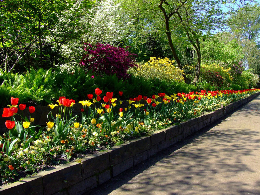
Green will be everywhere in 2017. But not just any old shade of green; we will be seeing a vivid version of the color that looks like a brash blend of mint and lime called Greenery. And it will be on everything from the walls, furnishings and appliances in our homes to the fashions we wear and vehicles we drive or ride. So says the Pantone Color Institute, which has christened Greenery the 2017 “Color of the Year”.
Really? How much stock can we put in a hue that Realtor.com calls “the weirdest color of the year ever”—especially when two of the nation’s most venerated paint companies, Benjamin Moore and Sherwin-Williams, have picked the sophisticated and shadowy hues Shadow and Poised Taupe, respectively, as their 2017 Colors of the Year?
Greenery is not an easy hue to use, especially in the model home interiors, amenities and public spaces we design. The point is to please a wide range of consumers and inspire them to buy or rent houses or apartments. Greenery is pretty to some, but potentially provocative to others, which makes it a precarious option.
That is precisely why we don’t put much stock in short-lived fads such as the Color of the Year, particularly at a time when the housing market is slowing down a bit. But we do put a great deal of stock in the power of color – which solid research shows has the propensity to affect our moods – and color trends that are based on societal development.
For example, the right shade of red can raise a room’s energy level, since red has been scientifically proven to raise blood pressure and heart rates. And blue has the opposite physical effect, which makes it a soothing color that can motivate us to wind down and rest.
But no matter what we are designing, there are so many factors to consider that it’s not wise to rely on predictions about a Color of the Year. A designer’s goal (and our mantra at Mary Cook Associates) is to tailor the design of model home interiors and amenities to each project’s target market. That means understanding who we’re designing for, and what the selections we use in specific spaces will mean to them.
It’s also critical to take geography and longevity into account; a project in a warm climate, or for budget-strapped millennials, will require different hues than one with robust seasons and more established residents. Will a young family stretching to buy an upscale home really respond to a provocative color such as Greenery? Or will it appeal to well-heeled Boomers who are finally buying their dream home?
These are the questions we weigh in every space we design, because the right or wrong color can make or break a project. It’s important to be analytical and thorough when designing spaces that are meant to have broad appeal to potential homeowners. Color trends are important, but they shouldn’t lead you off a cliff—they should elevate a homeowner’s quality of life.
So what does all this mean for Pantone’s 2017 Color of the Year? We don’t agree with Realtor.com; Greenery is an engaging color with a lot of kick. We can definitely see using it in an indoor-outdoor space, or as an accent in the right setting. After all, as the venerable New York Times concluded in their piece on the hue, “the seeds have been planted” and “it’ll grow” on us.